DayDayCook Feature Prototyping and Design
Recently, I have begun getting more involved in our iPhone application's feature design and prototyping. I strive to find creative ways to make the app more lively and interactive as we continue to explore new ways to engage our audiences.


Increasing Engagement
Above is a rough sketch of an idea for increasing engagement and gathering more user data through our 签到 or "check-in" function. Currently, we the feature exists on a separate page and only as a check-in button. Once users check-in a certain number of times they are entitled to a free giveaway. In the design above, the check-in feature is placed on the homepage banner and asks the user which type of meat is her favorite. Upon answering beef, survey results are displayed alongside recommended beef recipes, a record of the user's check-in streak and her points to date. The bottom area of the ad is intended to have one recipe displayed in each arrow-shaped region.

Rethinking the Banner
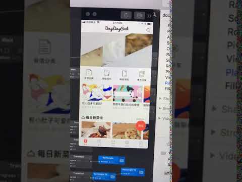
Above is a short video recording showing a prototype of my check-in feature and a new engaging form of video ad that I created using Sketch and Origami. With advertising click through rates falling across all mobile apps, it's easier than ever for users to ignore the banner. My goal with this prototype was to brainstorm more engaging and interactive methods of using the banner that would highlight our app's core strengths as a video platform and make better use of our check-in feature.
The check-in feature prototype uses a random number generator and a series of if/then statements and switches to make the check-in quiz answer choices bounce up and down. The function ensures randomness of both the delay and the selection of UI component. The goal is to use randomness to capture the user's attention, as predictable movements are easier to ignore.
The video ad prototype uses bold, exaggerated animations to draw the user's attention, ending the animations by showing three different videos playing. My idea is to use ad formats like this to market groups of related videos and lead into a details page where the user can learn more about the videos and continue watching in full-screen.

Highlighting Key Features
Here I am experimenting with new methods to draw users into our relatively new activities pages (the section in the center of the screenshot, "讨论美食"). These activities see extremely high user engagement and typically collect many high quality comments. My hypothesis is that displaying a rotating selection of high quality comments from the activity itself we can better give new users an idea of what happens within the activities page and entice them to join the conversation.